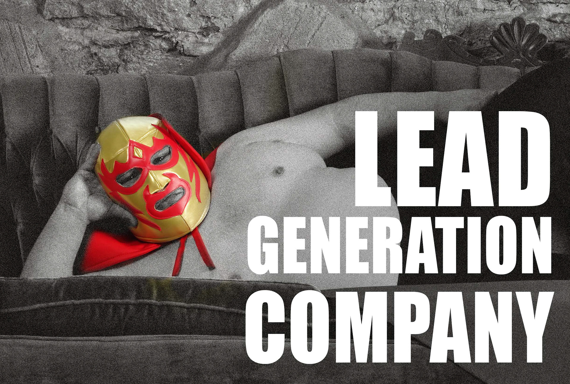
WANNA LEADS ltd. is a young marketing company looking for a STRONG, BOLD identity and let's face it ... BAD.
The project entrusted to me consisted in the development of a brand identity that could convey these prerogatives with the need to rapidly increase the company's notoriety in the specific marketing sector for lead generation.
The project entrusted to me consisted in the development of a brand identity that could convey these prerogatives with the need to rapidly increase the company's notoriety in the specific marketing sector for lead generation.
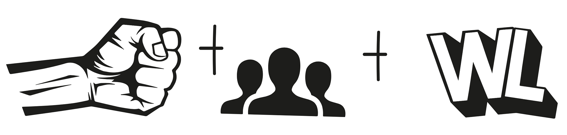
So the efforts were immediately concentrated in an ironic key, of brute but not brutal force of a show in short! And what is the show that drives audiences crazy for its audacity based on bad but not dangerous showdowns? Wrestling.
This is where our adventure starts:
What does WANNA LEADS ltd do?
Lead generation.
Users interested in different types of advertising campaigns. Obviously companies are greedy for it. In today's world, web marketing cannot ignore it.
What does a wrestler do?
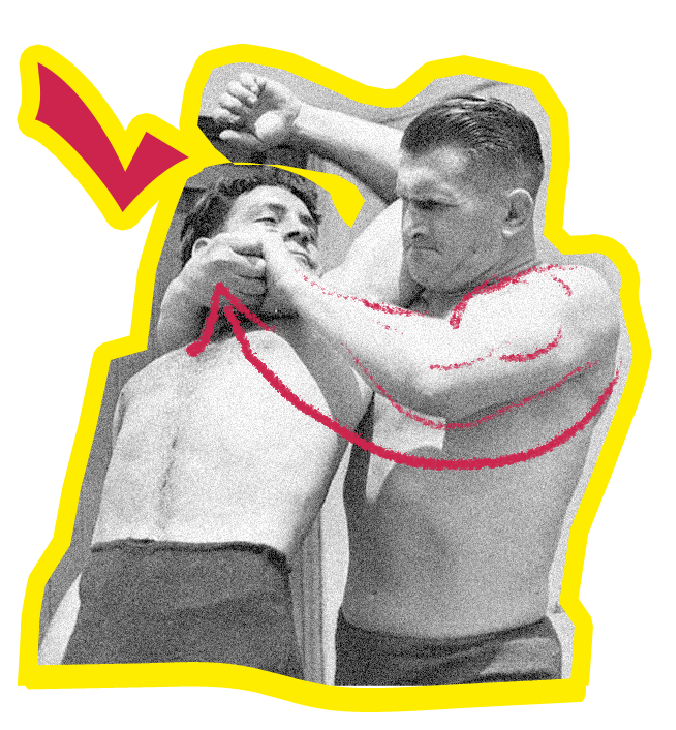
Squeezes, takes, grabs whoever is in the ring.
And this is precisely the link on which the second step focused: Integrating the mood of wrestling (catch) to the company mission (lead generation).
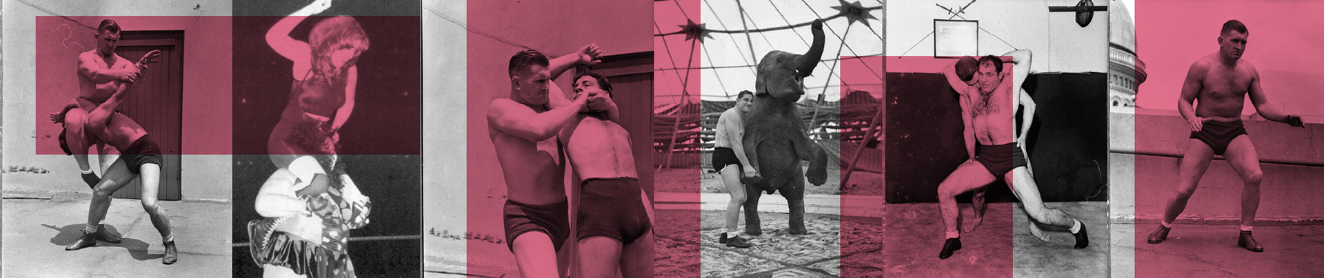
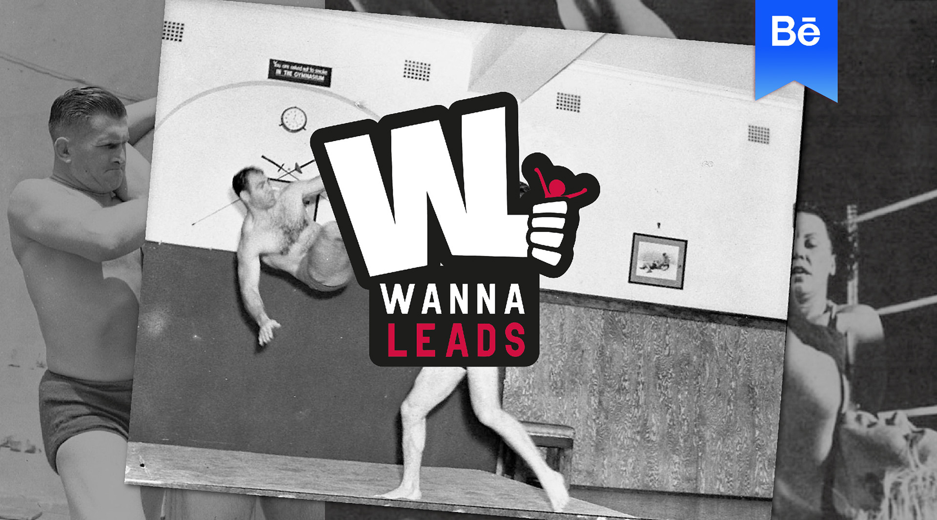
The images of wrestling, let's say contemporary, are far from that world we wanted to convey to the brand. The wrestling of the early 1900s was more like a Greco-Roman wrestling, with no chairs, benches or other tools recently used for the show.
A wrestling in which whoever took the opponent first won. Made of squeezes and holds bad but not dangerous, remember it was a show for a paying audience played by professionals or presumed ... after all.
A wrestling in which whoever took the opponent first won. Made of squeezes and holds bad but not dangerous, remember it was a show for a paying audience played by professionals or presumed ... after all.
Therefore, the stock photos then used on the site and in the social networks will all be black and white: newspaper clippings with graininess or pasty from the printing of the posters.
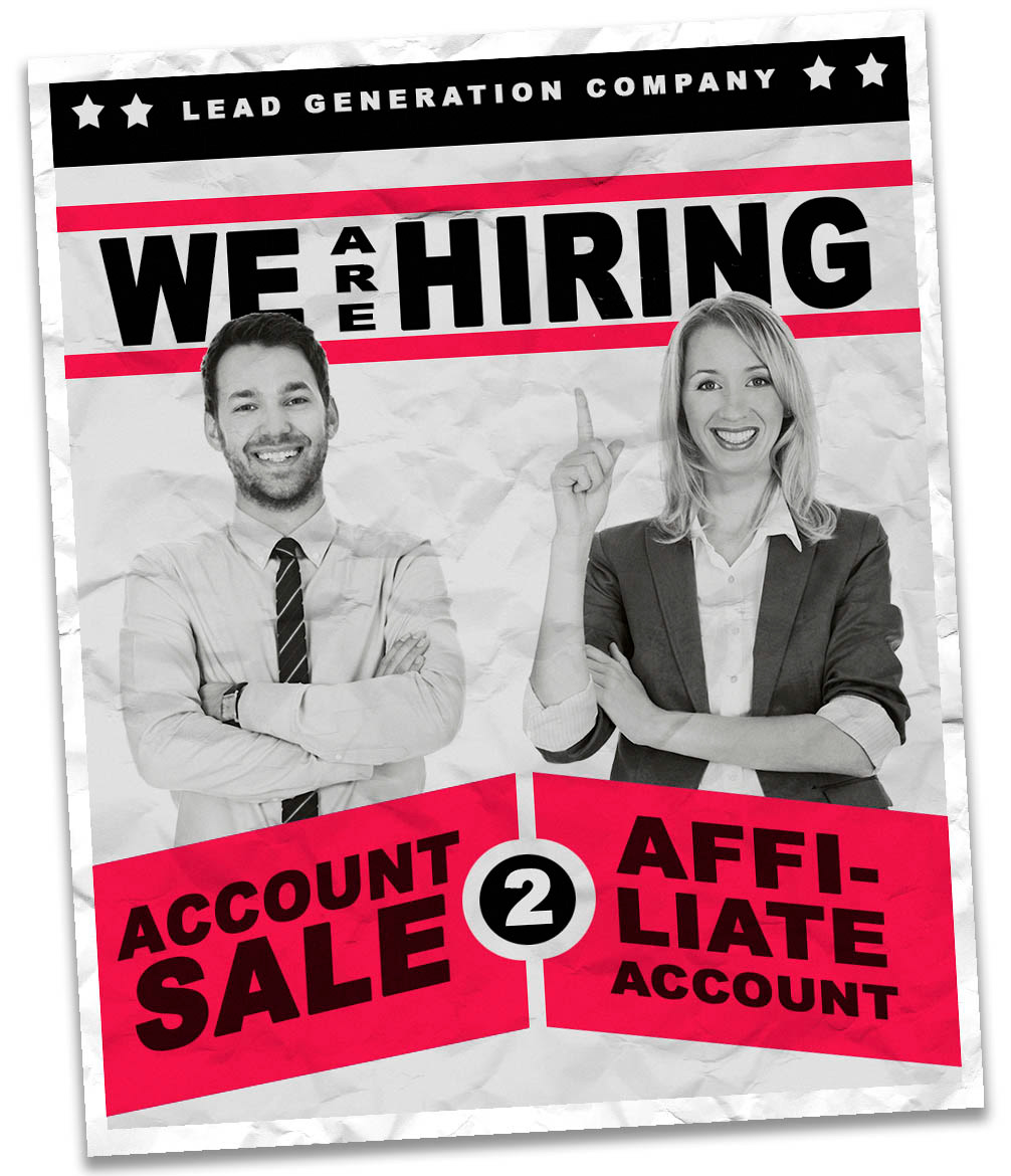
...so even before the logo had started, the company WANNA LEADS already asked us to create a job advertisement to be circulated on social networks to create curiosity around the company. The result is this:
LET'S START DESIGN Logo!
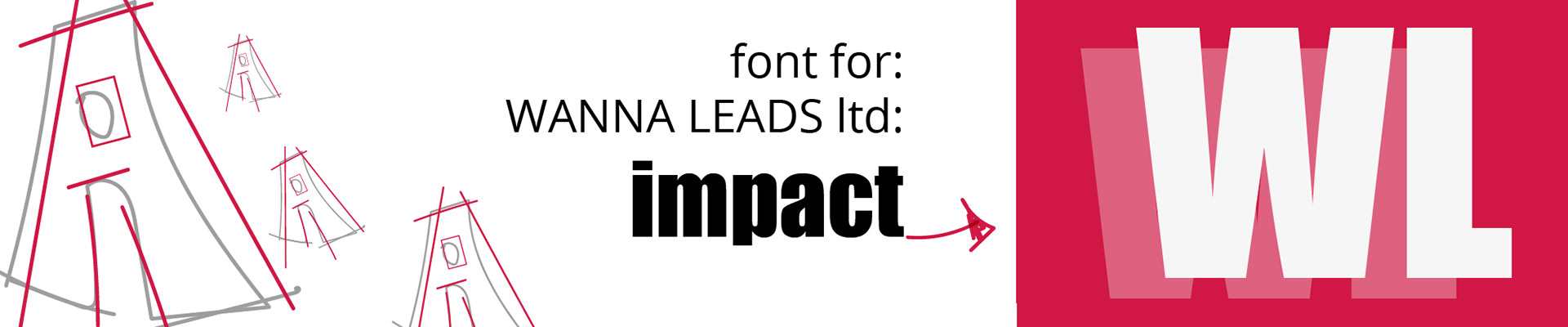
FONT & PALLETTE
The letter "w" with which Wanna Leads and Wrestling begin respectively has been emphasized using the acronym of wanna leads by translating the logo to WL.

The colors used are:
Red - par excellence the color of the Force, of the God Mars and psycho-attitudinal studies have shown that on the web, if used wisely, it can convey enthusiasm and memory compared to a logo of a more tenuous color.
Red - par excellence the color of the Force, of the God Mars and psycho-attitudinal studies have shown that on the web, if used wisely, it can convey enthusiasm and memory compared to a logo of a more tenuous color.
Yellow like the gold - in slight contrast with red, it recalls champions, cups, medals, numbers ONE.
White no to bright - not very bright but with an attuant in the degree of brightness of the lights aimed at recreating that newspaper, print, poster setting.
Black not black - Black also has the black point component raised in favor of a decrease in contrast aimed at favoring the materiality of subsequent graphic creations.


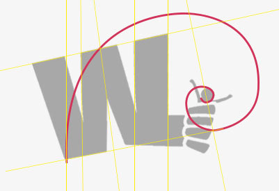
Once we developed the lettering of the logo, it seemed appropriate to insert a more iconic figure. While maintaining a dry style we started working on the idea of "catching" "catching" "catching" users / leads.
At the level of scale, we have moved to a dimension from KING KONG. 🦍
This is the result of several attempts:

SOCIAL SOCIAL SOCIAL!

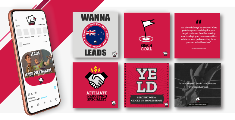

Customer WANNA LEADS Ltd, lead generation company was delighted with the logo. The aggressive and at the same time ironic spirit has fully centered the corporate mood.
This graphic project was also followed by the development of the company slogan:
WITH US THEY HAVE NO ESCAPE!
To reiterate how the volume of leads is large and generous.

Design: Noemi Quartucci
for WANNA LEADS ltd. Lead generation company
Visit company website: https://wannaleads.co.uk/